


Two magazines, reviewed
The tables have turned!

Canadians in the art world love to lament the lack of magazines, specifically culture magazines, in the country. I do the same thing—but simultaneously let my subscriptions lapse and grow piles of unread magazine copies around the house. With the advent of Bill C-18, things are feeling even more bleak for the future of media.
So I decided to head to the bookstore and buy the latest copy of C Magazine and Border Crossings to look at them with fresh eyes. I intended to read them cover to cover, which I haven’t entirely completed (there’s a lot of writing! See below), but what I found both confirmed my previous understanding of the magazines and surprised me. Full disclosure: I have written for both magazines in some capacity.
Keep reading for my quick thoughts on two of Canada's most prominent arts magazines.
Border Crossings
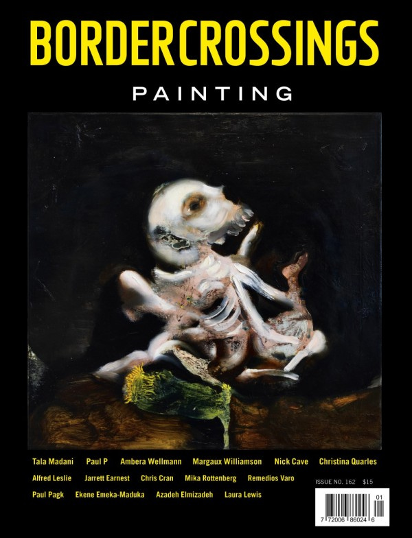
Six Paintings Travelogue, Text and Images by Jarrett Earnest was the standout feature in the magazine’s annual painting issue. The format was refreshing—brief journal entries alongside paintings. The paintings were great. I loved the way it interrupted the flow of the issue.
There’s an anecdote from Ambera Wellmann about opening a painting for her museum show in Turin, Italy, finding it lacking, and cutting it up to create a new work. Apparently, she was pushing out her paint cart hours before the media preview. I live for interview tidbits like this! Ambera is such a good painter.
The layout of Border Crossings, save for the above travelogue, is dense with images and text—a bit like a textbook. It’s so chockful of writing it overwhelms. After one long-form interview, my attention petered out, and I skimmed the rest.
Robert Enright does all the interviews in Border Crossings. He’s incredibly thorough and researches the subjects, which I greatly respect. But to the above, there’s a bit of monotony in the interview style that I find repetitive throughout the magazine. I craved a short form Q&A.
The strength of Border Crossings, imo, is the great selection of artists—some new and others familiar.
The reviews in the back of the book were great, with a wide range of writing styles and topics. The reviewers brought up points I hadn’t considered when viewing the exhibitions, precisely what you want a review to do!
C Magazine
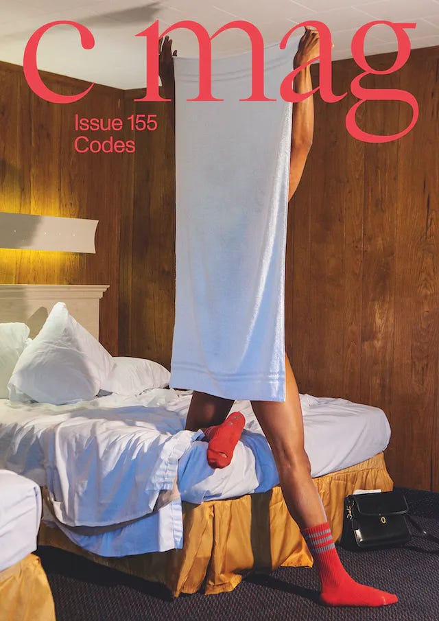
One of the best covers on newsstands right now. I love the photograph (and no cover lines to distract). It did take me a minute to find who the artist was: Elliott Jerome Brown Jr.
I feel like C Magazine has a reputation for being a tad scholarly, verging on dense. A blurb for the recent issue confirms this reading: “This issue expands on codes as ethical, social, political, and legal boundaries—considering them as sets of visible and invisible instructions moving within and beyond the digital imaginary.” I understand it, but I had to read it a few times. In these situations, I love to remind myself that I have an MA in Literature…
But! The writing in the issue is very readable, approachable, and enjoyable. I was pleasantly surprised. The articles span a variety of topics and forms but had a firm grasp on the overall theme. Overall, it’s full of excellent writing that introduced me to various artists, topics, and writers.
Matt Nish-Lapidus’s article on the worldbuilding and poetic potentials of code was especially delightful. The essay takes us through Nish-Lapidus’s early experiments with code via Logo, converging with the work of Alison Knowles and Jon Corbett. The essay includes just the right amount of coding language to get me excited about a form I typically find out of reach of understanding.
The layout of the issue is very contemporary. In other words, lots of white space. This matches the conceptual leaning nature of the content.
My number one gripe with C magazine is that they rarely use subtitles. And their titles are…vague. In publishing, a good hed (headline) and dek (sub-header) signpost what an article will be about for the reader. Without the added context, I was in the dark. I had to work out the topic/artist/subject as I read, which was disorienting. C Mag editors, if you’re reading this, please add more context to your headers.
Overall, I wonder why art magazines (not just Canadian ones) have such a rigid structure (walls of text + images) that other magazines don’t share. Think of a food or fashion magazine. They have a variety of content: roundups, short articles, long-form investigative pieces, image-based content, shopping guides, city guides, etc. Art magazines tend to be a bit more cut-and-dry—essays about art, interviews with artists, and reviews of art shows. There’s room for more experimentation, more risk, more PLAY.
If you look at the advertisers for the above magazines, they’re primarily institutions. Schools, museums, not-for-profits. If the content and format were to widen, would the readership and advertisers follow suit? My hunch is yes, making a more sustainable media model.
A little reminder: The best way to support Canadian media is to pay for it. Subscribe to a magazine today! Share it with friends. Post about it online. If media companies can’t post or link to articles, we should respond by talking more about them in different forms. Maybe instead of a book club…a newspaper/magazine/article club.
As always, feel free to email me or comment your thoughts. xx Tatum